The Best of The Best: Saul Bass
Saul Bass is the best of the best when it comes to minimalist poster designs. His posters are still praised today. As a lot of critics had said his movie poster are timeless. He still impresses me. among many others with his art work. One of his most famous quotes really makes me think. And every time I think the same thing and that is how true this quote really is. "My initial thoughts about what a title can do was to set mood and the prime underlying core of the film's story, to express the story in some metaphorical way. I saw the title as a way of conditioning the audience, so that when the film actually began, viewers would already have an emotional resonance with it." I can tell you that not nearly as many movie poster designers think this way anymore, which is really too bad, because it is the way to create amazing and memorable pieces.

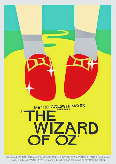
His Wizard of Oz poster still blows my mind even today. After I've looked at it over fifty times. He has the 2-7 elements in this poster depending on how you look at it. To think that someone could create this so long ago without the technology we have to day is impressive. He has the main parts of the movie, the red ruby slippers and the yellow brick road. And that right there could very well explain the story. Of course you could go into further detail, but then again it wouldn't be a minimalist poster if it had more, would it? It wouldn't because a minimalist poster is defined as a style that, in graphics, presents the object in question (a shoe, a dove, a dog a building, for example) plainly, starkly and with a high degree of realism without extra decoration. It may also repeat the image a number of times. Think of it as a representation of the thing itself without added artistic devices.
The Beginner: Melody Baker
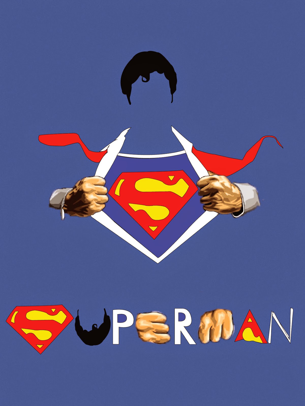
This poster was a class assignment, were all of the students were trying to make posters like Saul Bass. And those poster are minimalistic, which tell you the underlying story to the view, only using 3-5 colors including black and white. We are supposed to use Saul Bass posters as inspiration. Recreating a movie poster from the 1970's or earlier. It also need to use as few shapes as possible. You needed to tell the underlying story, but it also needed to make a design. So without further ado here is my final minimalist poster.

I decided to take what I thought represented the entire movie of Superman the best and simplify it even more. So by taking the idea of Superman ripping open his dress shirt revealing part of his Superman uniform. I thought that covered the entire Superman movie pretty well. How I created the title was I took elements of the poster to create the movie title. The S is the S logo on his shirt, the U is his hair, the P and R were made like how I made parts of his dress shirt. The E and the M are part of his knuckles, the A is an edited part of the Superman logo, and then the N is made from the shirt collar that is being ripped open. And I included his hair, because other than the S logo his hair is his next most famous thing. Superman wouldn't be Superman without his hair. That is everything I thought and every reason I made this poster.

Well articulated ideas Melody! Nice job.
ReplyDeleteGood Job. You did a good job explaining Saul Bass then relating it back to your poster.
ReplyDelete