~Responsive Web Design (RWD) is a web
design approach aimed at crafting sites to provide an optimal viewing
experience; easy reading and navigation with a minimum of resizing, panning,
and scrolling; across a wide range of devices, from mobile phones to desktop
computer monitors.
~Think about how your business' customers interact
with your website. A poor mobile experience can be disastrous for small
enterprises attempting to build their digital businesses. What has become
clear is that businesses must redesign their online presence to take mobile
device access into consideration. Responsive design allows the creation of a
website that reformats its contents depending on what device it is being viewed
on. Clearly, a website will look and behave very differently on a 27-inch
desktop monitor than on a 9-inch tablet PC. Responsive design takes these
differences into consideration to ensure that the user experience is
always optimized.
~Media Queries is a CSS3 module allowing content rendering to adapt
to conditions such as screen resolution (e.g. smartphone vs. high definition
screen). It became a W3C recommended standard in June 2012. and is a
cornerstone technology of Responsive Web Design
~Break points in RWD are browser widths that have a media query declaration to change the layout once the browser is within the declared range. One average, every responsive site will have a minimum of two break points. These being for tablets and mobile devices. Unlike the desktop, tablet and mobile are based on the screen sizes of the iPhone and iPad because they are the most popular devices in both mobile and tablet devices. Whether or not this is a best practice is best saved for later.
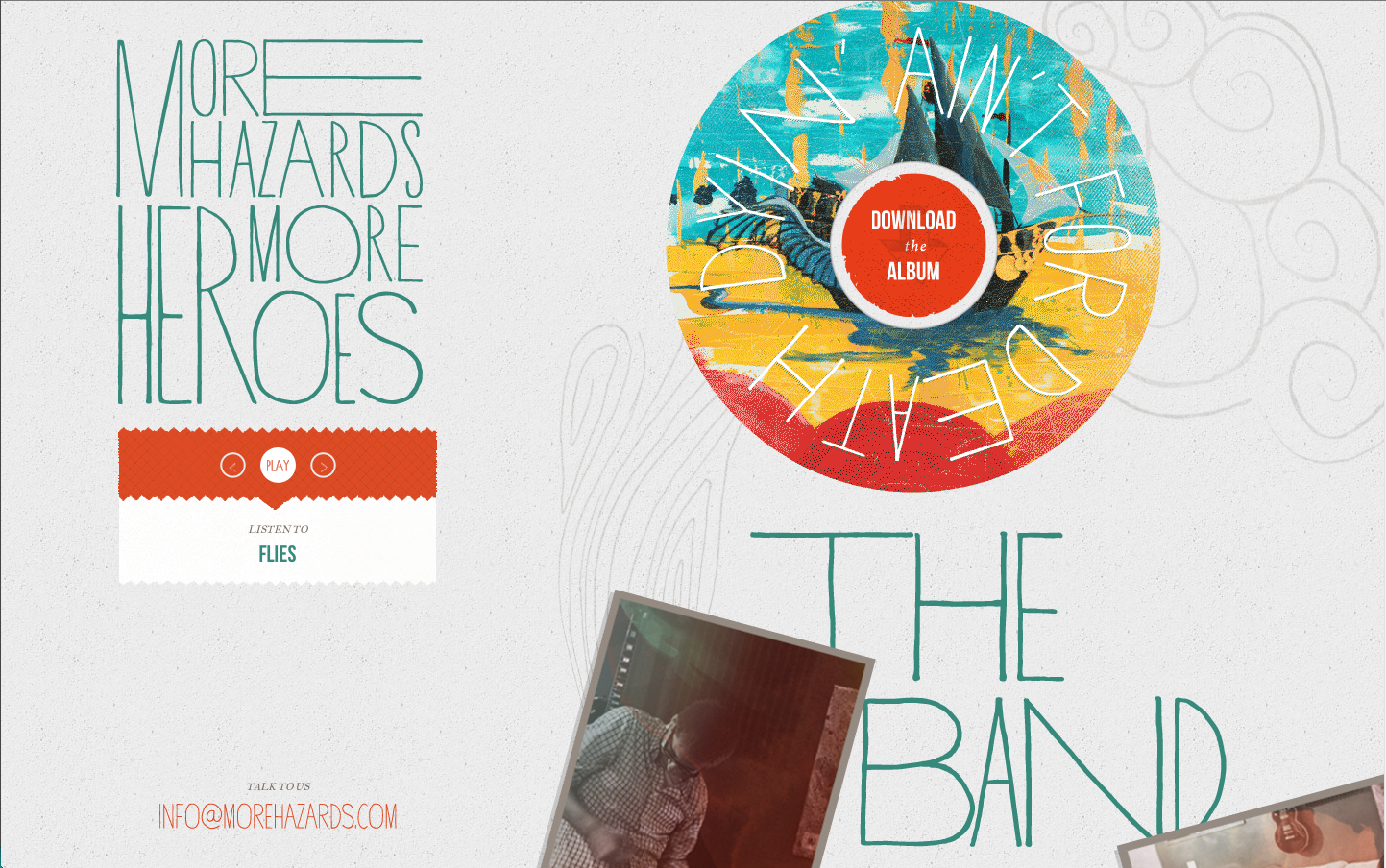
More Hazards More Heros:
Medium: There is 2 columns. The images are balances and the normal size. The type is all the same size because they are headings. There is no menu for this site. The contents itself is no seen because you must scroll down to view it. The contents that you see is the place where you can download their album.
~Break points in RWD are browser widths that have a media query declaration to change the layout once the browser is within the declared range. One average, every responsive site will have a minimum of two break points. These being for tablets and mobile devices. Unlike the desktop, tablet and mobile are based on the screen sizes of the iPhone and iPad because they are the most popular devices in both mobile and tablet devices. Whether or not this is a best practice is best saved for later.
More Hazards More Heros:
Narrow: There is 1 column. The images are balances and the normal size. The type is all the same size because it is a heading. There is no menu for this site. The contents itself is no seen because you must scroll down to view it. The contents that you see is the place where you can download their album.
Wide: There
is 2 columns. The images are balances and the normal size. The type is all the
same size because they are headings. There is no menu for this site. The
contents itself is no seen because you must scroll down to view it. The
contents that you see is the place where you can download their album. With
this view you can see more of the sketches in the background.


Cool example site.
ReplyDeleteResponsive web designing is also beneficial for owners who are trying to get better SEO rankings as the website offers a single unique URL across all platforms and devices. There are numerous success stories in the industry where companies have reported an increase in mobile clicks to their website by as much as by 50% ever since they revamped their websites with a responsive web design. Assorted Design has quicklybuilt an excellent reputation as a responsive web design provider
ReplyDelete