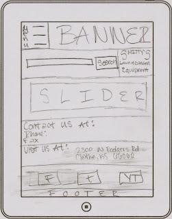
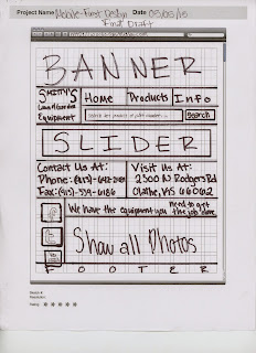
Step 1: Sketch the mobile design
Design #1:
Design #2:
Step 2: Sketch the tablet design
Step 3: Sketch the desktop design
Then it's time to get onto the computer and get to work. BUT STARTING WITH MOBILE FIRST!!!
Step 4: Mobile Design
Step 5: Tablet Design
Step 6: Desktop Design
And that is pretty much the end of Mobile First Design designing, besides actually publishing and uploading the site.
Last Thoughts and Comments:
Now if you are looking at my sketches and comparing them to my actual design, you can tell they are VERY different. Why, you ask? Well when sketching these out I didn't realize the complexity of creating the site from mobile to desktop.
If I were to go back now and recreate this website, I would be able to do much better. I understand the concepts and know more. I know that I need to use display:none; instead of visibility:hidden;
for hiding divs. I really enjoyed this project however. I prefer to just make a website responsive.
Check it out at http://eravensonline.net/students/448mfb09/MobileFirst.html


No comments:
Post a Comment