At the beginning of this week I realized many issues with my current project proposal. The main issue was that I can't really schedule when to take photos. So this week I spent much of my time thinking everything out and I believe I have found the best solution as far as planning proposals go. I will be making my website and researching and testing image plug-ins for my website. Then as I go along I will periodically be taking photos and editing them. I have also decided to periodically do the rest of my Lynda.com videos, because a whole week of videos and note taking is very taxing. So I made a those changes to my proposal.
I decided that it would be a good idea to review my notes. When I went to review my notes they were chaotic and messy and overall hard to read. So I thought why not retype and reorganize my notes. I even split my notes into two different note pages, one for basic and general photography and then into portrait photography. Each has their own subsections as well. I remember more and feel better about my understanding of the notes I took. I also feel that if I do need to reference my notes I will be able to find this information much easier.
The biggest thing I took out of this week is, well two things actually.
One my proposed plans will be changing frequently due to photography's chaos.
Second is that I really need Mr. Olson (my advisor) because he really is the voice of wisdom and is so helpful.

Sunday, January 24, 2016

Friday, January 15, 2016
Senior Project - Week 1
So I am starting my senior project and I chose to further my knowledge of photography. I thought I knew the basics, but it turns out I knew the basic of the basics. So I learned a lot from Lynda.com. I learned the basics of photography and then a ton about Portrait photograph, which will be my genre focus of photography for next week. Some of the things I learned about the basics of photography are discussed below.
SLR stands for Single Lens Reflex. I knew that SLR was a typed of camera I'd just never know what it stood for until now. There is also what they call Mirror Less Cameras and they are smaller and more compact than other cameras. Then there is the camera everyone is familiar with or at least heard of which is the Point and Shoot Camera. They are the cameras you get your 12 year-old for their birthday or even just your phone camera. That's it for cameras, but then with cameras their are also lenses. So for lenses the instructors simplified it majorly by saying that there are basically three very simple categories of lenses. The first of those is normal, which is how your eye sees the image without the camera there. The second is telephoto, which makes distant subjects appear closer. Then lastly is the wide angle, which is moving further away from your subject giving you a wider view. A big part of learning the foundations of photography is to learn about lenses and learning about exposure and the qualities of light and composition. I learned so much about the basics of photography. All of the basics of photography are the same for portrait, but you have to take them to the extreme and be very careful. You don't want any scary portrait photos. The biggest thing I took out of this week is that each photograph you take is a two-dimensional version of a three-dimensional scene.
SLR stands for Single Lens Reflex. I knew that SLR was a typed of camera I'd just never know what it stood for until now. There is also what they call Mirror Less Cameras and they are smaller and more compact than other cameras. Then there is the camera everyone is familiar with or at least heard of which is the Point and Shoot Camera. They are the cameras you get your 12 year-old for their birthday or even just your phone camera. That's it for cameras, but then with cameras their are also lenses. So for lenses the instructors simplified it majorly by saying that there are basically three very simple categories of lenses. The first of those is normal, which is how your eye sees the image without the camera there. The second is telephoto, which makes distant subjects appear closer. Then lastly is the wide angle, which is moving further away from your subject giving you a wider view. A big part of learning the foundations of photography is to learn about lenses and learning about exposure and the qualities of light and composition. I learned so much about the basics of photography. All of the basics of photography are the same for portrait, but you have to take them to the extreme and be very careful. You don't want any scary portrait photos. The biggest thing I took out of this week is that each photograph you take is a two-dimensional version of a three-dimensional scene.
Monday, September 21, 2015
Fine Designs - Web Design Portfolios
Four Inspiring Designs (To Me):
Oberüber Karger:
http://oberueber-karger.de/Five things I enjoy about this site's design:

2. The consistent menu through all pages, making it easy to find
3. A very simple homepage that isn't terribly confusing and busy
4. A cute, but readable font, making the site more appealing and personalized
5. There is great color contrast between the background image(s) and the text.
Rokivo
Five things I enjoy about this site's design:

1. The rollover menu buttons add a classy more sophisticated look to the site
2. The parallax is incredibly smooth and fast loading
3. The logo has a rollover gif of sorts so that when you hover over the logo is switches through the name through the slogan (as seen above)

4. The menu shows up again after having already scrolled down, giving users easier access
5. The footer is very professional and classy due to its great organization
Guido La Rocca
Five things I enjoy about this site's design:

1. The menu tab/page adds a clean and classy look, not cluttered
2. The slogan tell you about them right off the back
3. The photography is amazing - clear, clean, descriptive, to the point, and personalized
4. The icons of the social media sites instead of just the names of the site is very cute and cool

5. The way every page of the site loads is vert classy and affective
Magnet Co
Five things I enjoy about this site's design:

2. The contact information is in two places on the homepage, which makes it really easy to find
3. The little blurbs about what they do and each of those blurbs logos, very cute, but constructive

4. The meet the people page is very cute and creative, this could be like an "About Me" page
5. The color scheme of the entire page is vert appealing and pleasing
Top 10 great design elements from these sites:
- Consistent Menu
- Appealing Color Scheme
- Contact Information
- Contrast Between Background Image and Text
- Rollover Menu Buttons
- Classy and Clean Footer
- Social Media Icons
- Hero Image
- An About Me Page
- Rollover Logo
Overall this project showed me how involved portfolio's need to be. They are very interactive but simple. I hope to create a successful portfolio that is clean, clear, simple, interactive, creative, and above all unique to me.
Friday, August 14, 2015
Free Photo Website Comparison
Comparing four free photo website, Morgue File, Pexels, Gratisography, Unsplash.
I was searching for the photos of sunsets.
Pexels provided the best overall photo.
Pexels offered the widest variety in photos.
Morgue File and Pexels are tied for the easiest search engine to navigate.
Gratisography was the easiest website to download photos off of.
Pro: Easy to search with many photos.
Con: Downloading process is slow and sometimes doesn't work.
Pro: Easy to search with a WIDE variety of photos.
Con: Downloading process has a couple steps that could be cut out.
Con: No way to search for a specific photo.
Pro: Offers a variety of very high quality photos.
Con: Downloading process is very confusing.
The next time I need a free photo for a website I will use Pexels, because they have the widest variety of high quality photos with a decently easy downloading process.
I was searching for the photos of sunsets.
Pexels provided the best overall photo.
Pexels offered the widest variety in photos.
Morgue File and Pexels are tied for the easiest search engine to navigate.
Gratisography was the easiest website to download photos off of.
 Morgue File
Pro: Easy to search with many photos.Con: Downloading process is slow and sometimes doesn't work.
 Pexels
Pro: Easy to search with a WIDE variety of photos.Con: Downloading process has a couple steps that could be cut out.

Gratisography
Pro: Easy downloading process: click and it's downloading.Con: No way to search for a specific photo.
 Unsplash
Pro: Offers a variety of very high quality photos.Con: Downloading process is very confusing.
The next time I need a free photo for a website I will use Pexels, because they have the widest variety of high quality photos with a decently easy downloading process.
Tuesday, May 19, 2015
Mobile First Design
Mobile First Design is an approach outlined by Luke Wroblewski. Simply put mobile first is an approach to responsive design: design for smaller screens first, then add more features and content for bigger and bigger screens. This design approach is also known as "progressive enhancement." So you start by making your mobile design first and then your tablet design and then finally the desktop design. The assignment was to create a mobile first design with Smitty's Lawn and Garden Equipment.


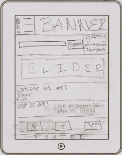
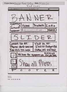
Then it's time to get onto the computer and get to work. BUT STARTING WITH MOBILE FIRST!!!


Step 1: Sketch the mobile design
Design #1:


Design #2:


Step 2: Sketch the tablet design


Step 3: Sketch the desktop design

Then it's time to get onto the computer and get to work. BUT STARTING WITH MOBILE FIRST!!!
Step 4: Mobile Design

Step 5: Tablet Design

Step 6: Desktop Design

And that is pretty much the end of Mobile First Design designing, besides actually publishing and uploading the site.
Last Thoughts and Comments:
Now if you are looking at my sketches and comparing them to my actual design, you can tell they are VERY different. Why, you ask? Well when sketching these out I didn't realize the complexity of creating the site from mobile to desktop.
If I were to go back now and recreate this website, I would be able to do much better. I understand the concepts and know more. I know that I need to use display:none; instead of visibility:hidden;
for hiding divs. I really enjoyed this project however. I prefer to just make a website responsive.
Check it out at http://eravensonline.net/students/448mfb09/MobileFirst.html
Thursday, April 23, 2015
Site Builder Project
For this project we were each given a different web builder interface to try and create a website. We were supposed to have 5 pages and our theme was Earth Day. I chose to create a website all about water. So here is a tour of the web design builder interface of Froont.
 When you first enter the website you will see this. If you click on "Watch video" you will see a small overview of the web builder Froont. If you click on "Start Designing" you will come to a page where you can create an account. After you create your account, you can choose to use a template or you can start from scratch.

When you want to create the new page is will have you chose a page title and whether or not you would like the page to be private or not.
 I chose to start from scratch. So off to the left is what the template looks like. You can change what would be CSS off to the right of the page. To add in what is considered HTML off to the left.
 If you hoover over off to the left you can open a tab that is spilt up into sections. These sections make it easier to find what you want. If you click and drag the item you want into the white space if will add it with pre-filled with text so you can put in your own.
 If you add docs to the beginning of the URL you can go to what is a docs part of Froont called Froont Docs. This is a page full of tutorials and the intros to this specific web builder.

When you want to create the new page is will have you chose a page title and whether or not you would like the page to be private or not.
Thursday, April 2, 2015
Redesign X Like Y
In this project we had to find a high school website that need some updates. Then you were to find a business or company to redesign the high school website off of. I choose Nelson Island School from Toksook Bay, Alaska for my high school website. For my business/company website I choose Cold Stone Creamery.
Nelson Island School (X design) Before:
 As you can tell the website was created with a simple table no divs. Their site doesn't follow CARP too well. They also have nothing relative to their school on their home page. Their tabs are mostly useless and unnecessary. They could condense most of their tabs. They have lots of white and blank space. Their logo is almost unrecognizable. They haven't updated their website since 2009, or at least that's what the copyright says.
Cold Stone Creamery (Y design):
 Here is the Cold Stone Creamery website. This page was created with divs, rollovers, clean cut images, and is very organized. Their menu tabs are change when you hover. This is a fairly simple and nice website to try and redesign Nelson Island School like.
Nelson Island School (X design) After:
 As you can tell this new website has CARP. It has a more concise and condensed menu. They have a new logo, an Eskimo (like an Alaskan Islander). This logo is clean cut and very easily recognized. The tabs as on the menu change when you hover. And instead of an image slider I put a main information area for the school to put in their information.
To view the logo of Nelson Island School's old (before) website you'll need go to the website and zoom in on the banner. Their logo is too blurry for it to be put into this post but here is my newer, updated logo.

Nelson Island School (X design) Before:
Cold Stone Creamery (Y design):
Nelson Island School (X design) After:
To view the logo of Nelson Island School's old (before) website you'll need go to the website and zoom in on the banner. Their logo is too blurry for it to be put into this post but here is my newer, updated logo.
Subscribe to:
Posts (Atom)